
This graph was created in 1998 from data compiled by Micheal Mann and his collegues appearantly showing that the recent temperature increases are a severe exception to the natural climate events of the past 1000 years. It later appeared in the IPCC report of 2001.
Unfortunately, the graph prior to the 19th Century is not that reliable. Note the vast grey area, indicating the margin of error allowed in the temperature estimates. This is unacceptable! Clearly more research should have been done to better pin down the exact global temperatures and reduce the error margins. Since there was such a wide margin of error, the graph is useless as a guide to judging the actual global temperatures. We know there was a Medieval Warm Period (MWP: 800 to 1400 AD) and a Little Ice Age (LIA: 1500 to 1800 AD), but you really cannot see those periods on the hockey stick graph as depicted here.
This is a better representation of those periods, showing different temperature readings from various studies:
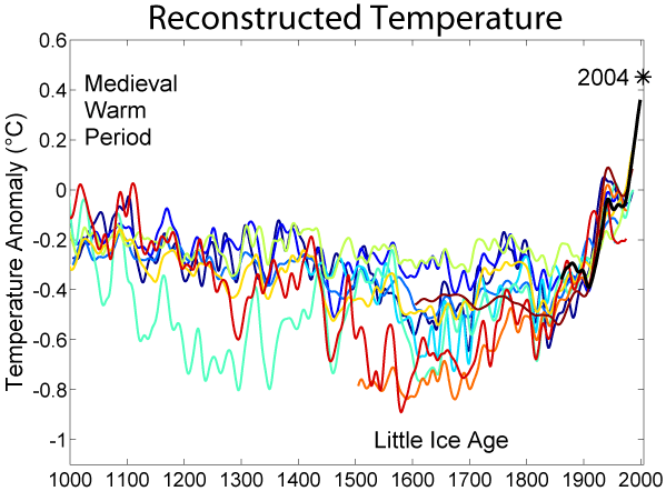
You can SEE the periods and how some of the temperature readings dip noticeably during the transition from the MWP to the LIA. It’s not much, because those events were only affecting the polar areas of the Northern Hemisphere, not the equatorial regions or the Southern Hemisphere. But they DID happen! Thus the original “hockey stick” graph is misleading in its appearance.
The shaft of the “hockey stick graph” is useless, but the blade is accurate because it was based on actual temperature readings. Here are the recent temperature increases in greater detail:

Denialists have made a great deal about how the global warming “scam” was based on the flawed hockey stick graph. But this is incorrect. In fact, the science behind global warming is based on the known properties of carbon dioxide and other greenhouse gases. It is amazing that denialists have never done experiments to disprove the heat retaining properties of the supposed greenhouse gases, for that is indeed the only way they can discredit the case for the man-made global warming hypothesis. So why have they not done this? Because they can’t!
It’s time to toss out the hockey stick of Dr. Mann and find more accurate data! Ironically, by doing so, we can make the case for doing something about global warming that much stronger!
Update: Since this blog entry was made, I have been informed that Dr Mann and his colleagues have already done exactly what I demanded and have discarded the original hockey stick graph themselves and replaced it with a more accurate study, based on more detailed and inclusive data. For more details, look here:
http://www.realclimate.org/index.php/archives/2008/09/progress-in-millennial-reconstructions/
You’ll find the ‘hockey stick’ reflected in this lot, too—
http://wattsupwiththat.com/2009/12/09/hockey-stick-observed-in-noaa-ice-core-data/
—worth a look!
Yep, it’s worth a look…..to laugh at! Did you not notice that the first temperature chart ends RIGHT AFTER 1900?! Anthony Watts cherry picked the data to mislead the viewer, the damned fraud! That’s why the instrumental readings of the past several decades are so important. And the proper way to interpret the data is to do it from several ice cores taken from various locations to cross check the accuracy of the work, not just ONE ice core from ONE place!
Watts committed an EPIC FAIL there! LOL!