Global warming denialists assert that the hockey stick graphs made in reference to global temperatures are highly questionable, if not faked outright. But I wonder if such claims could be justified about world population, which is certainly a factor in global warming. Check these out:


Compare those with the hockey stick graphs made in reference to past global temperatures:

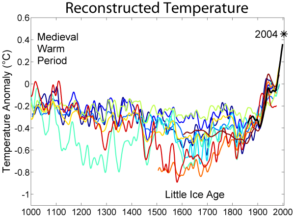
One must wonder, if denialists are so eagar to prove the hockey stick graphs of global average temperatures wrong, why they do not also attack population graphs in the same way.
Pingback: A flawed and misleading video about global warming « Dale Husband's Intellectual Rants